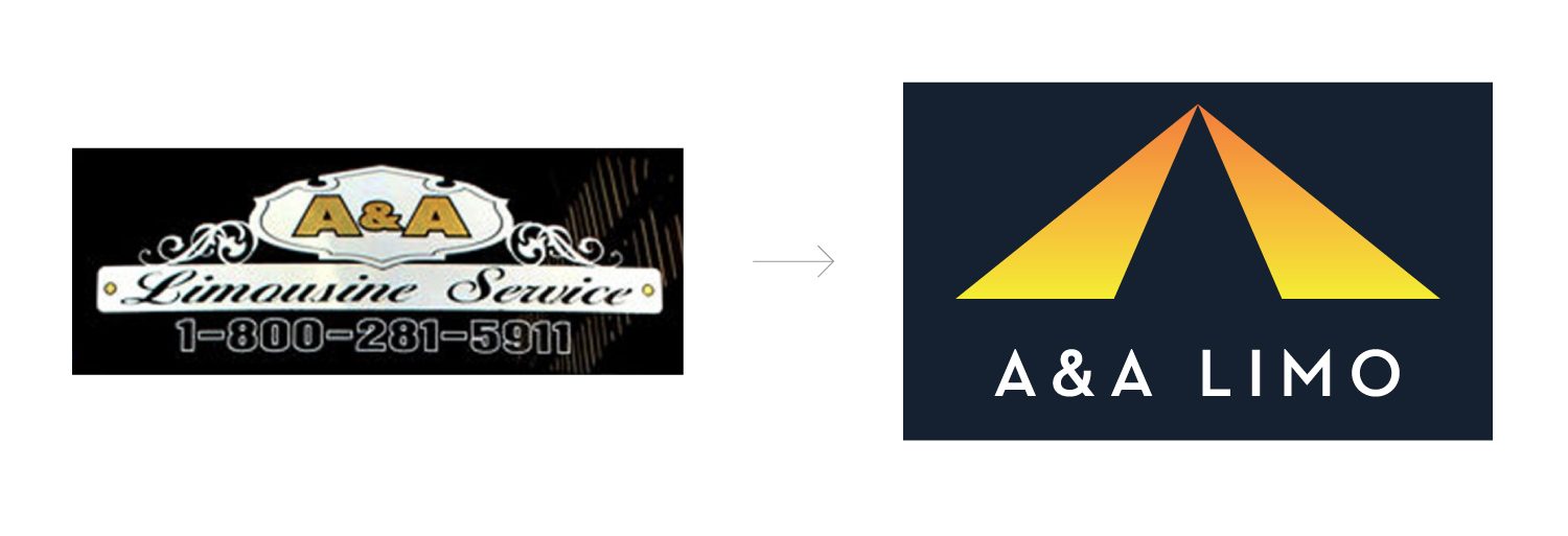
Identity Evolution
From an ever changing and inconsistent brand to a fully resolved and thought out identity. The details of the logo enhance the brand. The mark is both a road and a letter A. The mark fully follows the rule of thirds, and the negative space between the gradated shapes is exactly the shape of the letter A in the typography below. The colors represent their 24 hour service, from the time the sun rises and all through the night, A&A can accommodate you.
