Culver Duck
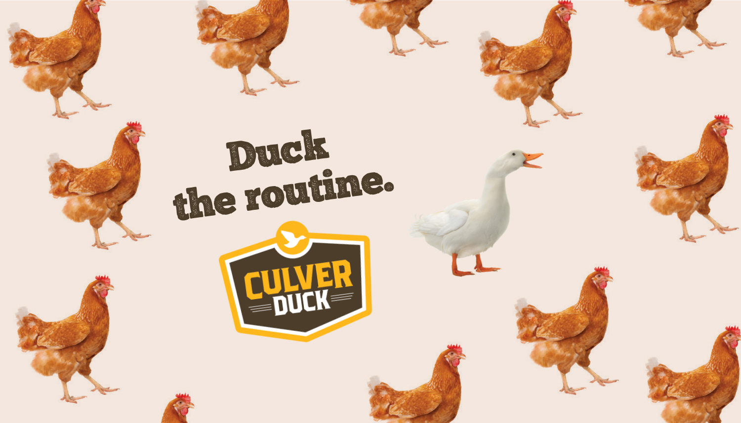
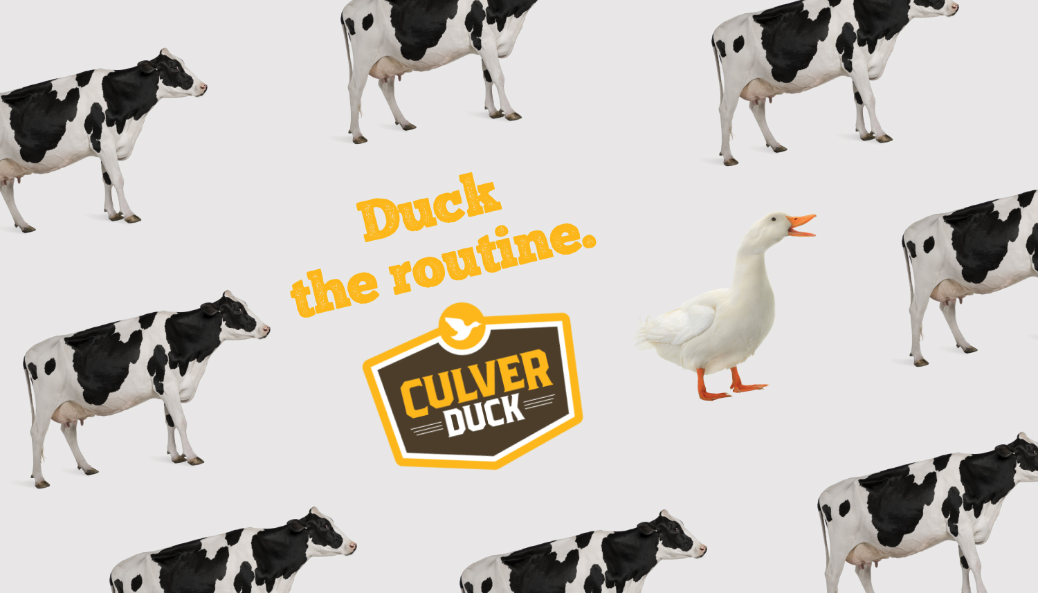
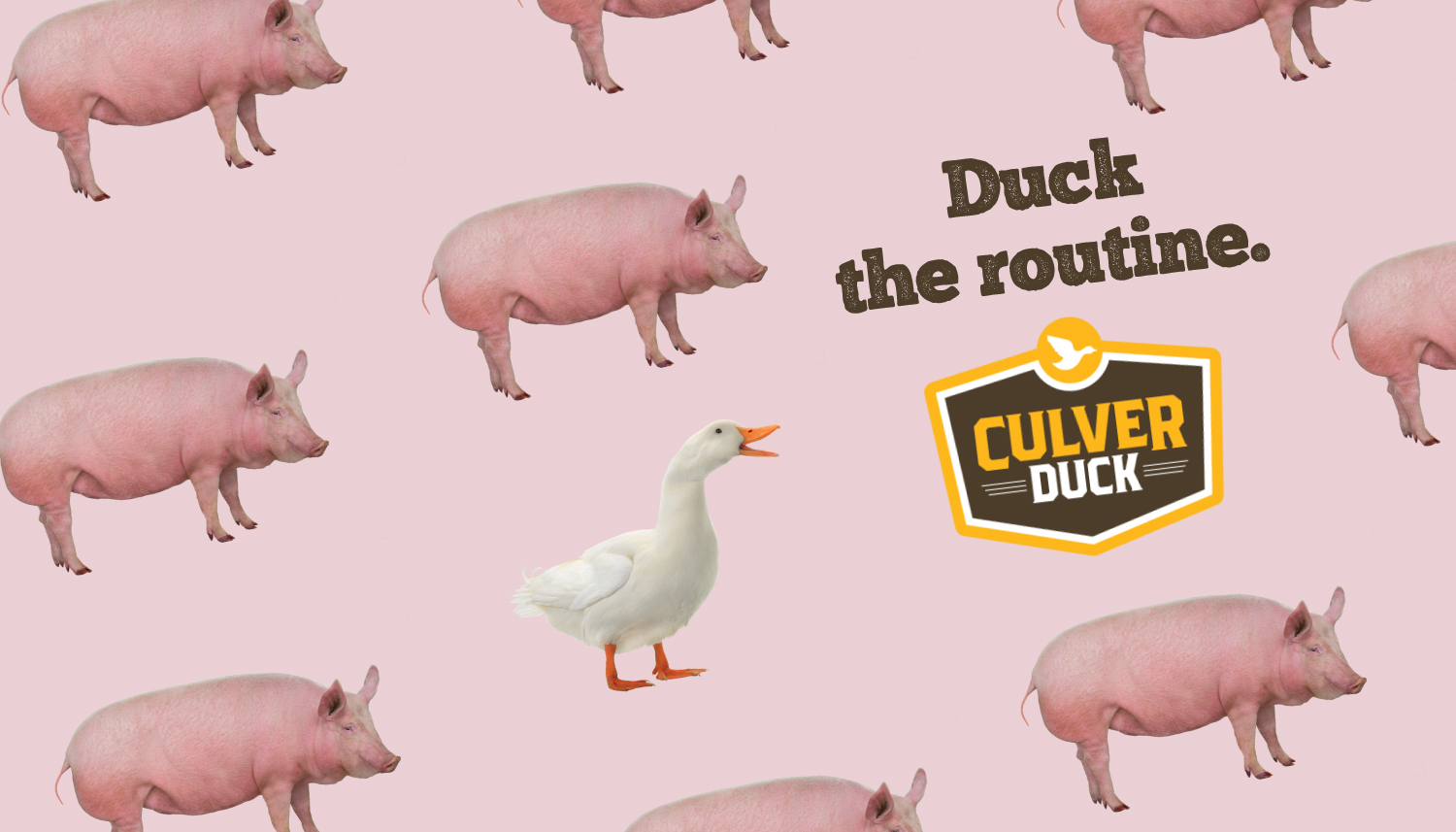
Duck the Routine
Client Type
Project
Culver Duck
Break out of your routine.
The design Meris did for Culver Duck and their product were both out of the norm. With the goal to make duck a more normal poultry option for dinner, we created a friendly design to encourage the purchase of such a product.
Branded for Success
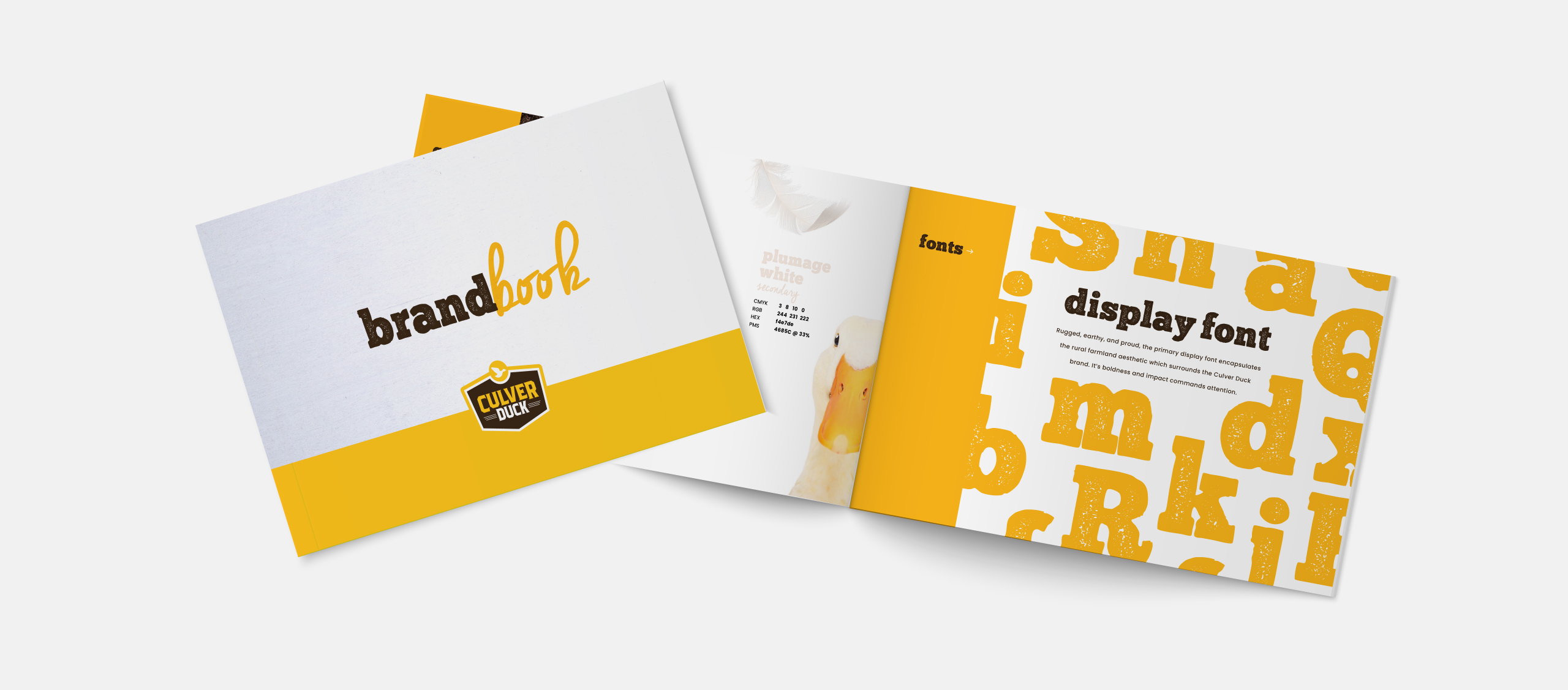
The Culver Duck brand book is full of personality. It lays out the rules for design within the scope of the brand, including colors, fonts, messaging and more.
Cooking Tips to Your Door
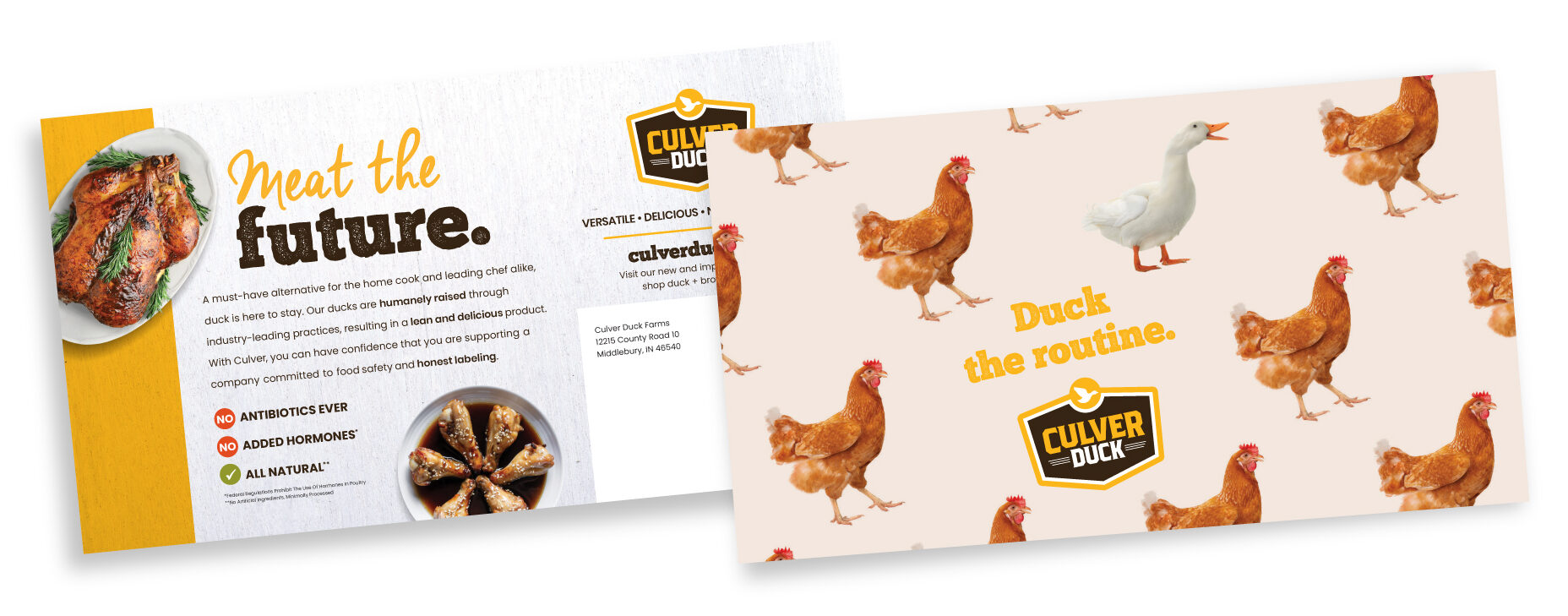
Normalizing duck is no easy feat! First we have to teach people how to cook it. Whether a home chef or a restaurant owner, everyone can benefit from the recipe sent and the knowledge of who they can get the main ingredient from.
Selling the Best
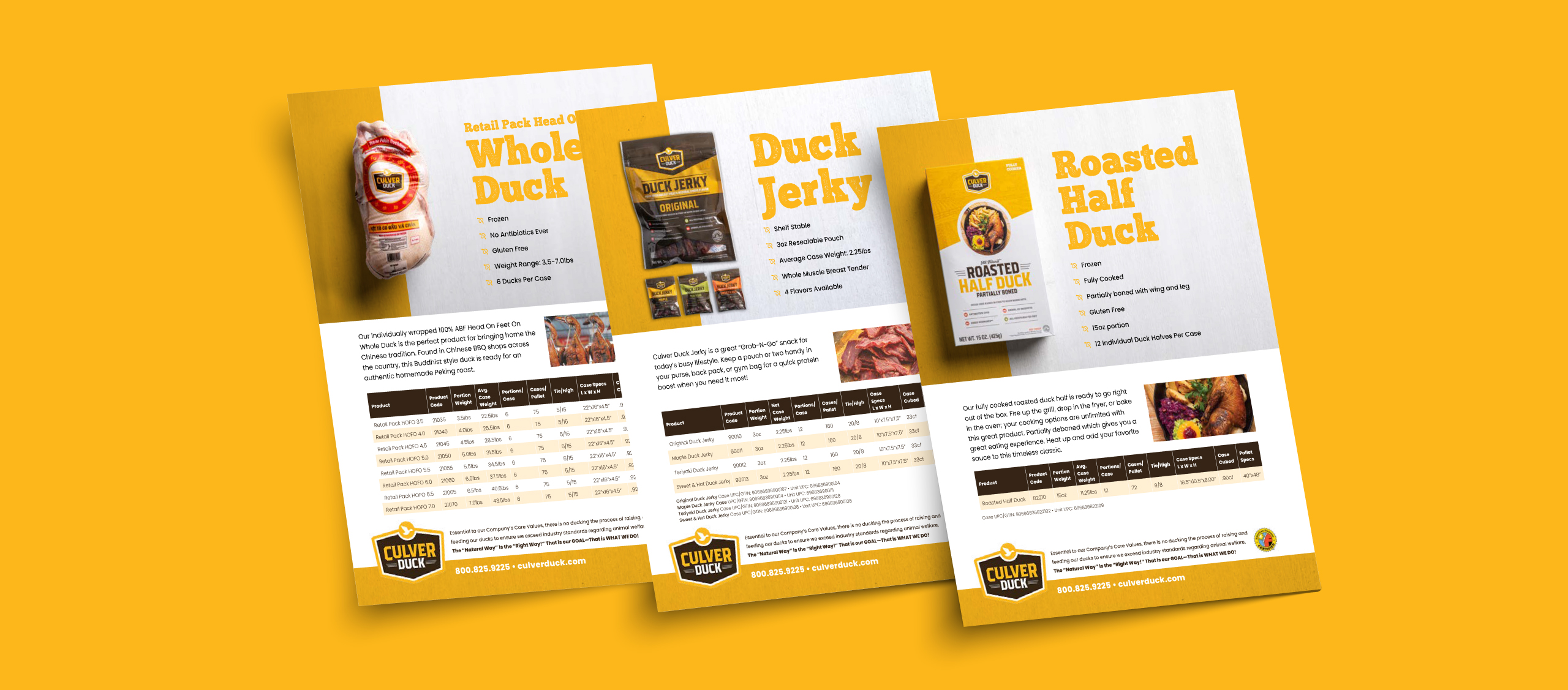
Selling items wholesale requires a team who can tout your products effectively everywhere. A comprehensive selling experience can include sell sheets so the sales team can present every chef, store, and distributor with the same branded information on your products.
Eye-catching Packaging
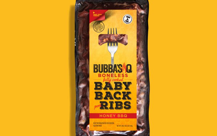
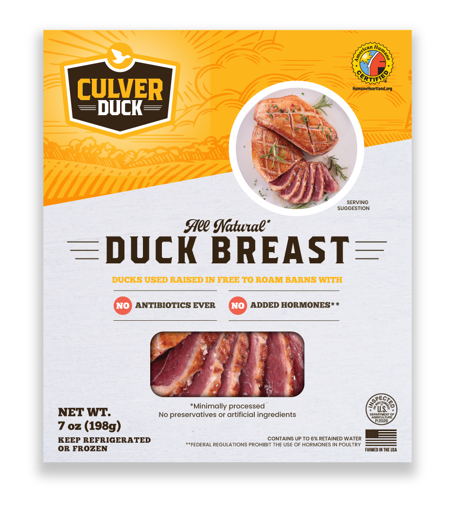
Every touch of the brand experience along a customer journey has to be cohesive. The packaging is usually the final step, but having good, clear packaging can make the sale, as well as entice a customer to come back for more.
Dynamic Digital Branding
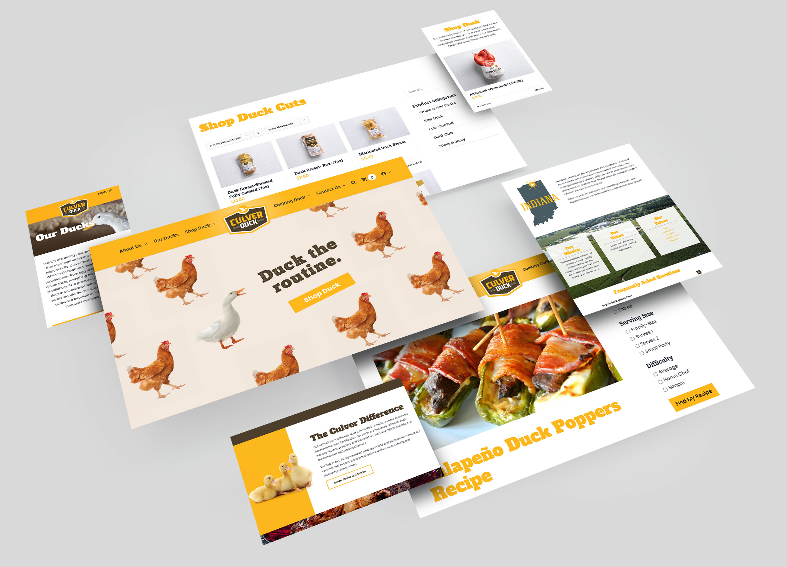
Culver may have had their logo in place when they came to us, but they still wanted their website to feel as exciting as the rest of their brand had become. Exciting and inviting, consumers can browse the site to learn about duck, purchase duck, and even find duck recipes to make cooking—and trying out this delicious poultry—a simple process. Check out the full website at culverduck.com.
