American Tire & Auto Care
Tremendous Upside
Client Type
Project
American Tire & Auto Care
Over the Top.
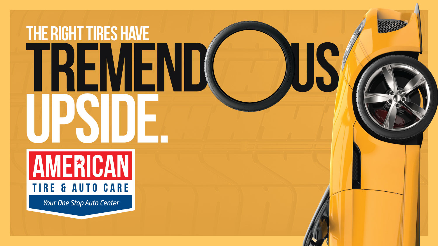
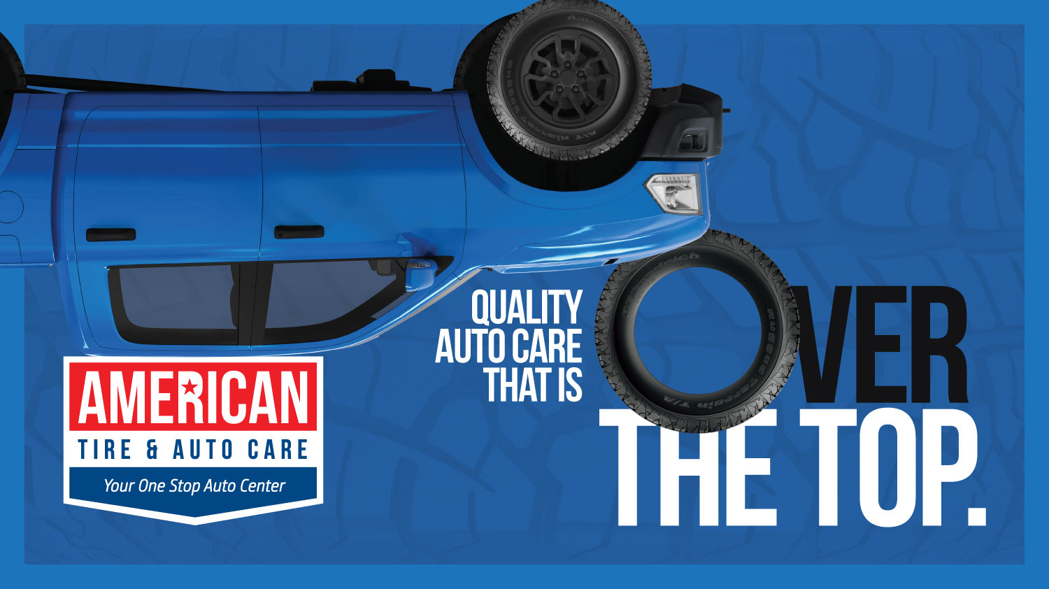
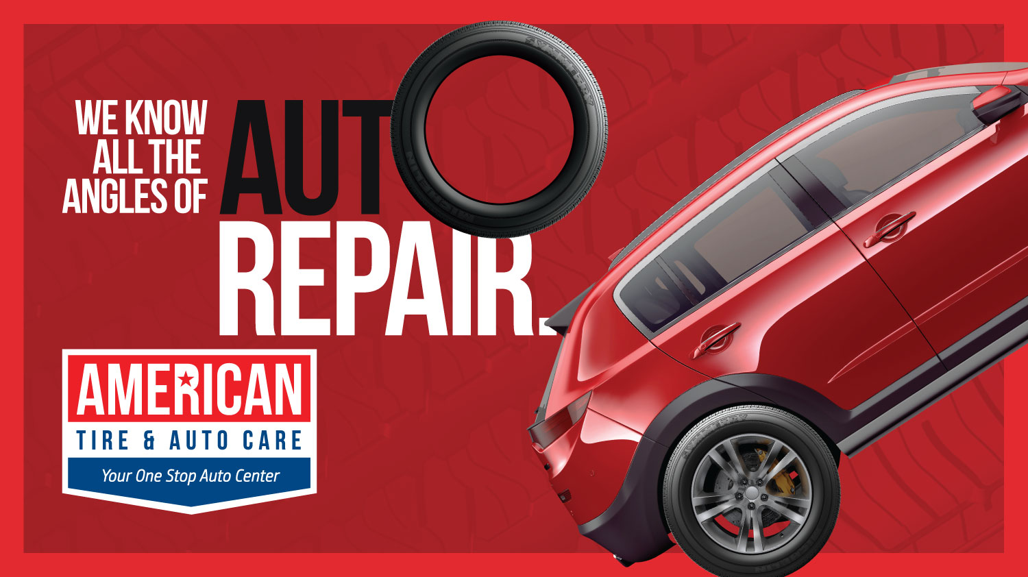
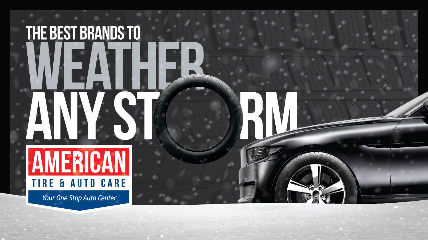
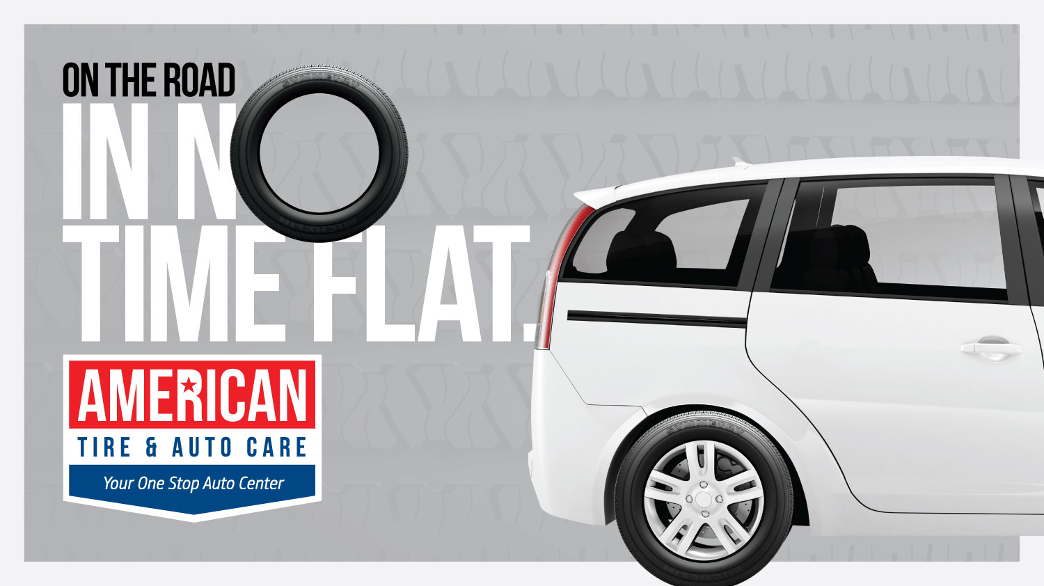
In order to make American Tire & Auto Care stand out in their marketing space, we looked away from traditional tire ads and found innovative ways to use the tire as an “O” with catchy headlines and fun colors to match. We also fine-tuned the logo to give it a modern look with updated fonts.
Wheely Good
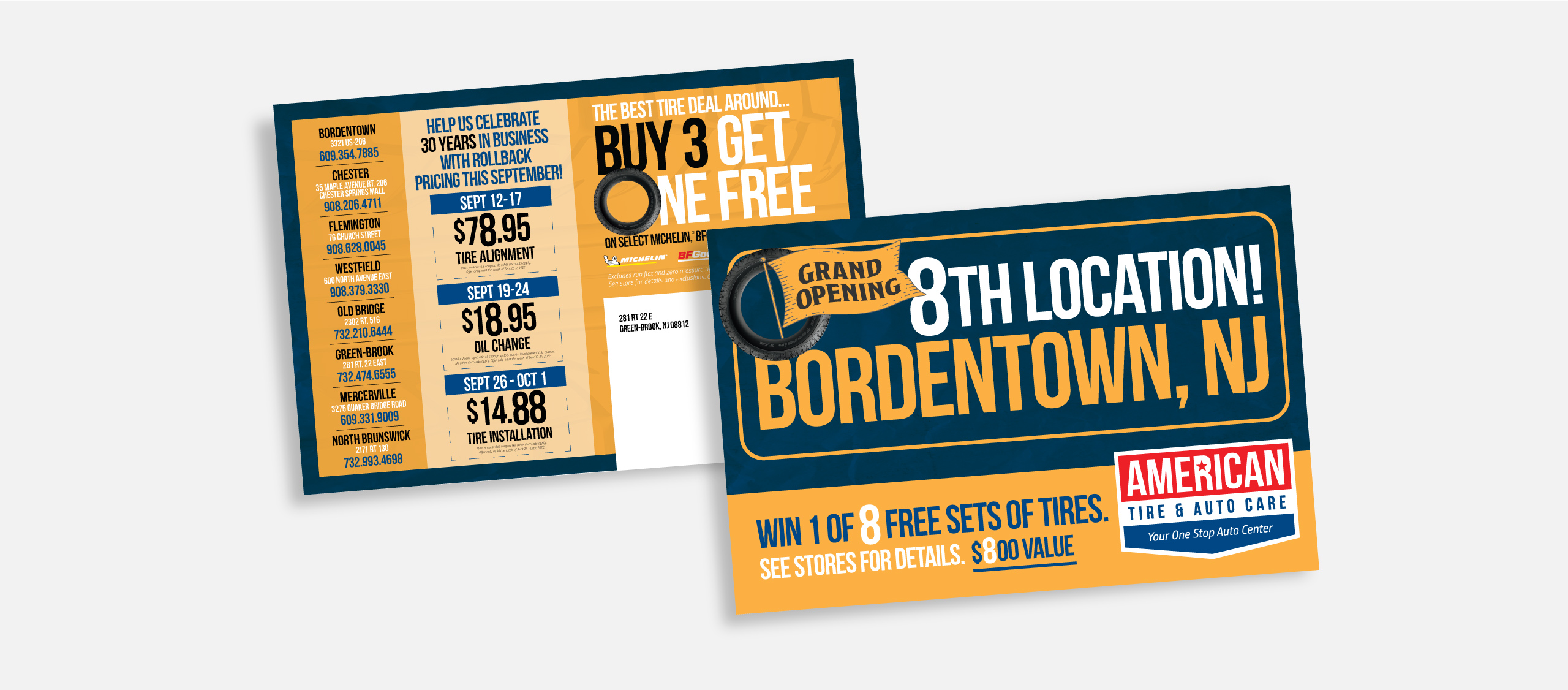
Quality care, parts, and service are surely something to write home about. That’s why we developed direct mail pieces for American Tire. To let everyone know
where to go.
That’s a wrap
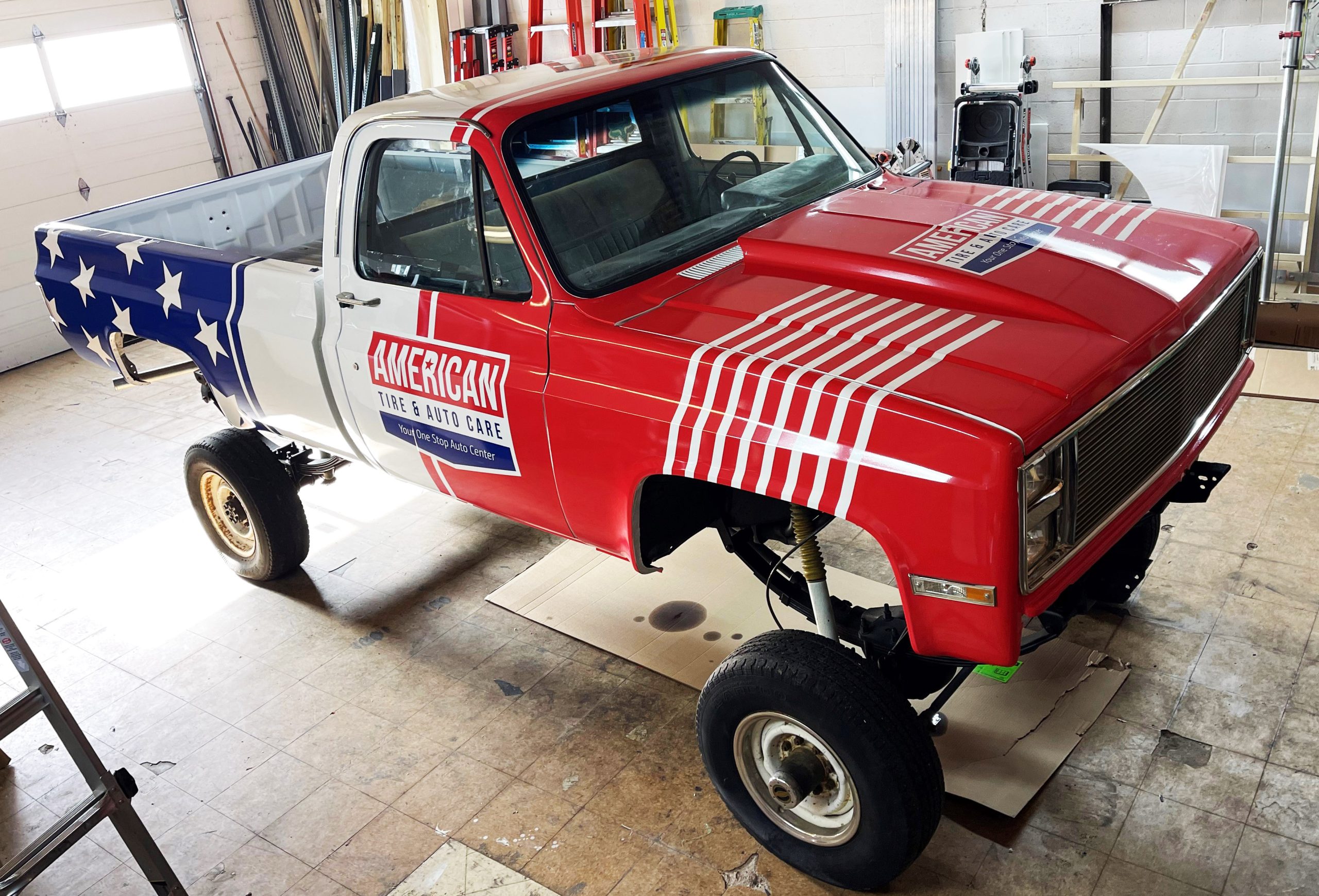
What’s more American than a monster truck? Nothing. That’s why it was the perfect fit for American Tire to extend their branding to a lifted ’87 Chevy.
Rolling Along
Billboard messaging was one of the ways we rolled out the word on American Tire.
Reaching the most captive and relevant audience, commuters stuck in traffic.
